
Essential Rules for a Professional Book Cover
Your book cover is the most powerful marketing asset you have. In a world where readers discover books primarily through thumbnails on Amazon, Goodreads, social media, or bookstore sites, a professional cover can dramatically increase clicks, sales, and reader engagement. A poorly designed one, no matter how great the story inside, often gets scrolled past in seconds.
What separates amateur covers from professional ones? It’s not just aesthetics—it’s following proven essential rules that balance creativity, marketability, readability, and genre fit. These rules draw from industry standards used by top publishers, designers, and successful indie authors in 2026.
In this guide for authoryn.com readers (authors, self-publishers, and creatives in Lahore and beyond), we’ll outline the core essential rules for crafting a professional book cover. Apply these whether you’re DIY-ing in Canva, hiring a designer, or refining an existing design.
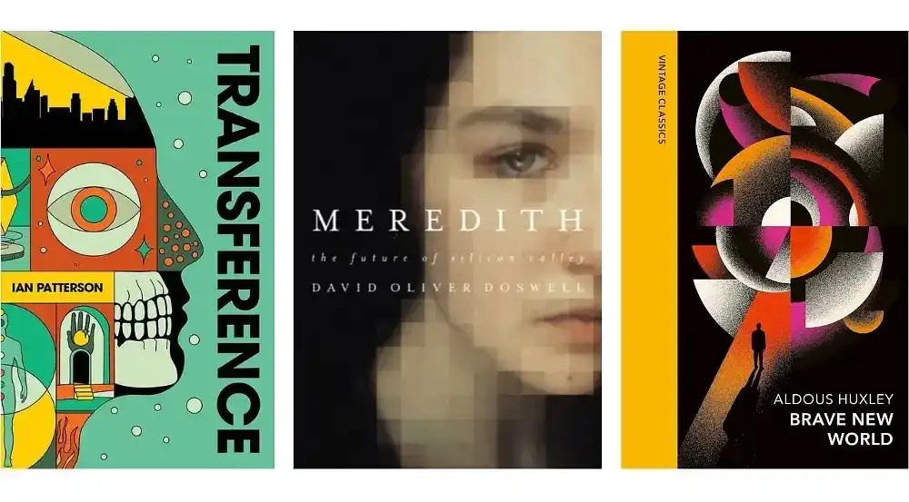
1. Signal Your Genre Clearly and Follow Conventions
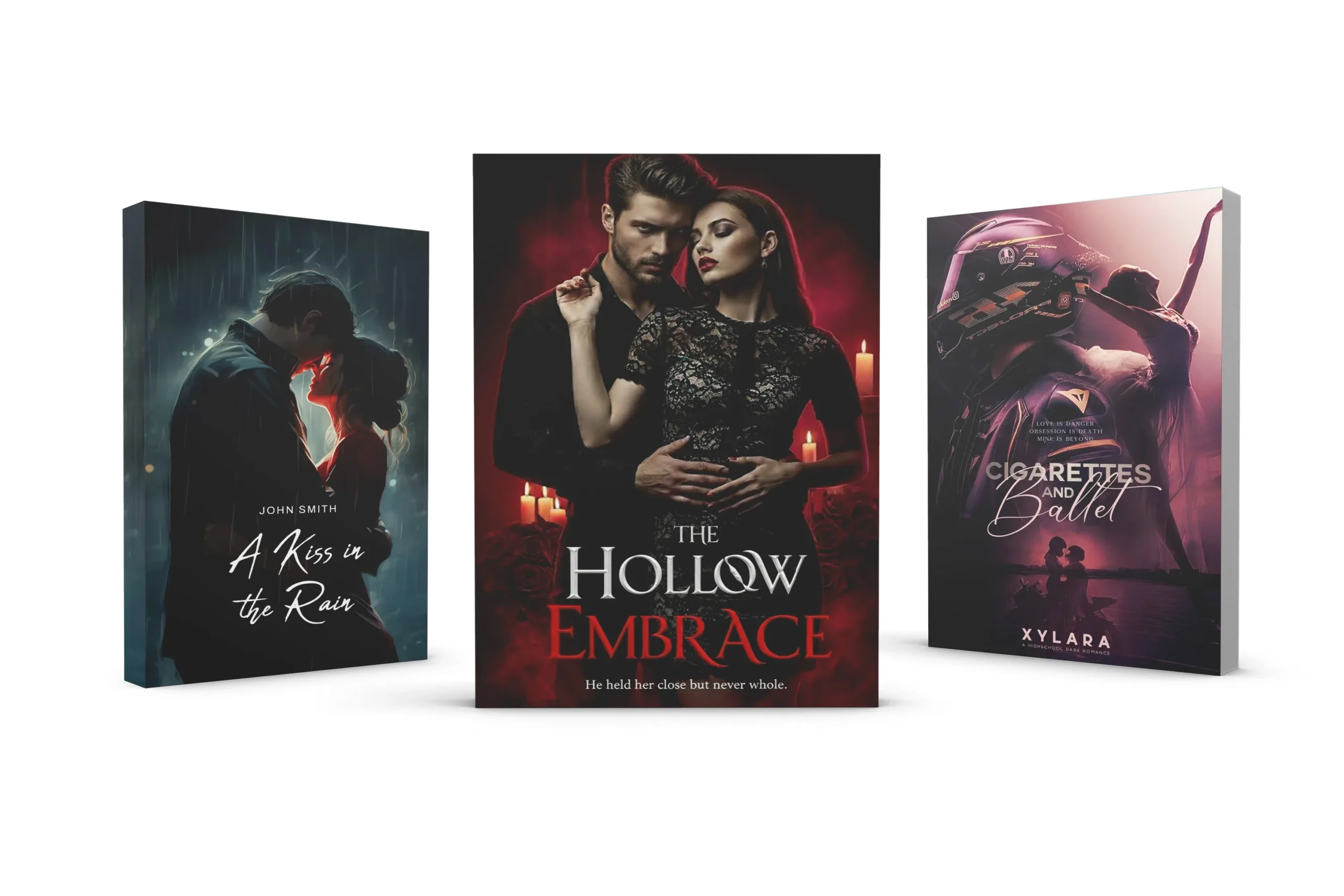
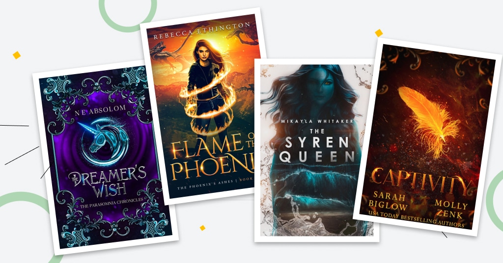
Readers buy books based on expectations. Your cover must instantly communicate genre and subgenre through visual cues like colors, fonts, imagery, and layout.
Why it’s essential: If your thriller looks like romance or your fantasy mimics non-fiction, the wrong audience clicks (leading to poor reviews) or the right one skips it.
How to apply the rule:
- Research 20–50 top-selling comps (comparable titles) in your exact subgenre on Amazon or KDP.
- Adopt 70–80% of shared elements: dark reds/blacks for horror, dreamy blues/purples for romance, bold sans-serifs for contemporary fiction.
- Differentiate subtly—don’t copy, but fit in enough to feel “right.”
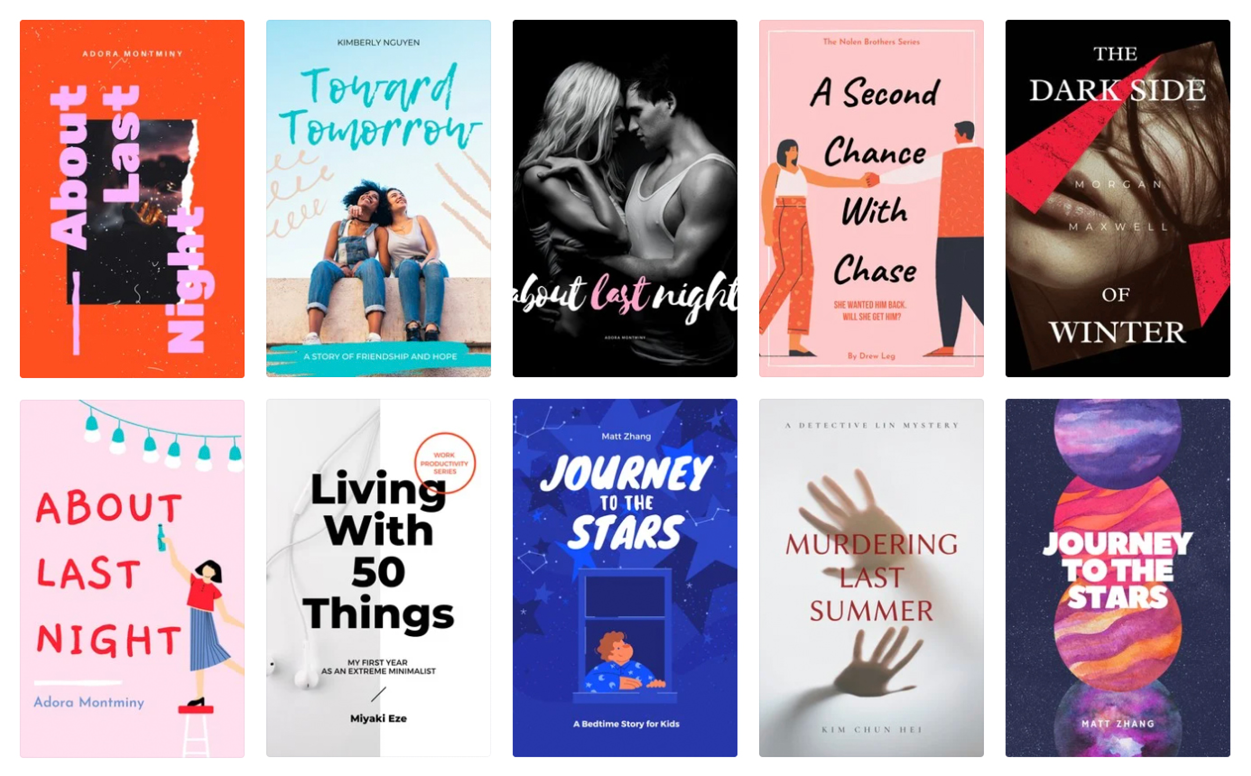
2. Prioritize Thumbnail Readability (The Blink Test)
Most sales happen at tiny sizes (150–300 pixels tall). Your cover must be legible and impactful in 2–3 seconds.
Why it’s essential: Poor thumbnail performance is the #1 reason books fail to sell online.
How to apply the rule:
- Test early: Shrink your design to thumbnail size repeatedly during creation.
- Use large, bold, simple fonts for the title (sans-serif or strong display fonts work best).
- High contrast: Light text on dark backgrounds or vice versa.
- Limit elements: One focal image or symbol + title + author name.
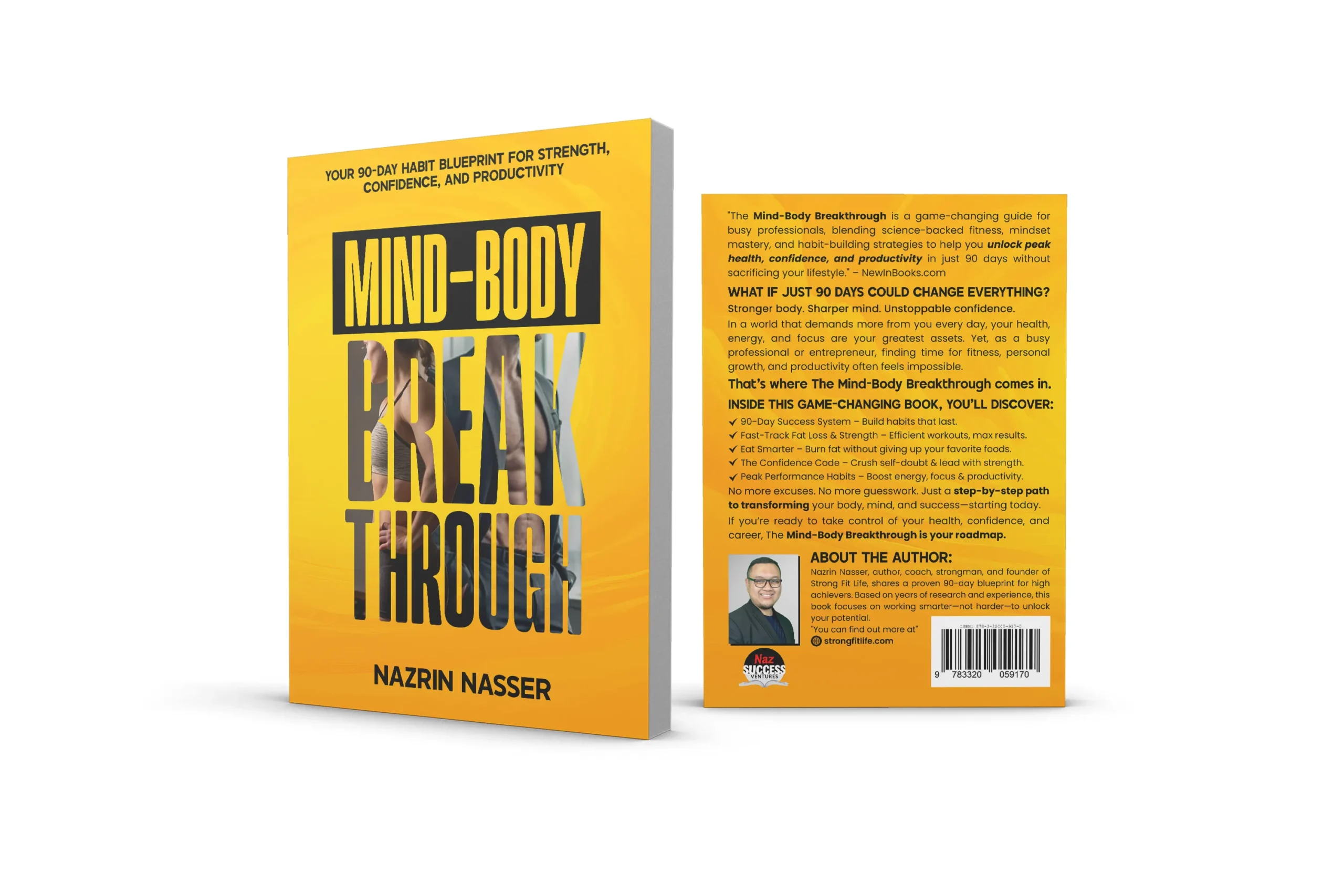
3. Create Strong Visual Hierarchy
Guide the viewer’s eye: Title first (largest/most prominent), then author name, subtitle/tagline last.
Why it’s essential: Without hierarchy, key info gets lost, reducing impact.
How to apply the rule:
- Title: 40–60% of cover height, bold/weighted heavily.
- Author name: Smaller (often bottom or top), but still clear.
- Use size, weight, color, and placement for emphasis.
- Apply rule of thirds for balanced composition.

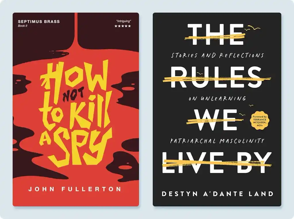
4. Use Effective Typography and Limit Fonts
Typography sets tone and readability—it’s often 50%+ of the design’s success.
Why it’s essential: Wrong fonts make covers look amateur; mismatched ones create chaos.
How to apply the rule:
- Genre-appropriate: Serif for literary/historical, sans-serif for modern/thriller, script sparingly for romance.
- Max 2–3 fonts: One display for title, one simple for author/subtitle.
- Proper kerning, leading, and alignment.
- Avoid overused free fonts unless customized.
5. Leverage Color Psychology and Contrast
Colors evoke emotion and tie into genre.
Why it’s essential: Wrong palette mis-signals mood or buries text.
How to apply the rule:
- Genre palettes: Reds/oranges for action, cool blues/greens for mystery, warm pastels for cozy.
- High contrast for text legibility.
- Limit to 3–4 colors; use tools like Adobe Color.
- Test in grayscale—design should still work.
6. Embrace Simplicity and Negative Space
Less is more—avoid clutter.
Why it’s essential: Busy covers confuse and look low-end.
How to apply the rule:
- One strong focal point (image, symbol, or bold type).
- Generous negative space to let elements breathe.
- Symbolic over literal: Hint at story without spoiling or showing too much.
7. Ensure High-Quality Imagery and Technical Precision
Pixelated or mismatched elements kill professionalism.
Why it’s essential: Low-res screams “indie amateur.”
How to apply the rule:
- 300 DPI minimum, CMYK for print, RGB for digital.
- Licensed/high-res sources: Shutterstock, Unsplash (edited), or custom art.
- Full wrap: Spine width accurate (use calculator), back cover cohesive with blurb, barcode space.
8. Test, Get Feedback, and Iterate
No cover is perfect on first try.
Why it’s essential: Objective eyes catch issues you miss.
How to apply the rule:
- Mockups (tools like Book Brush) for real-world view.
- Feedback from target readers, not just friends.
- A/B test thumbnails if possible.
- Refine 2–3 rounds.
Final Thoughts: Invest in Professional Quality
Following these rules turns your cover into a sales machine. For self-publishers on platforms like KDP or IngramSpark, a pro-level cover often pays for itself quickly.
At authoryn.com, we help authors craft standout books—explore our resources or services for more.