
10 Common Mistakes in Book Cover Design (and How to Avoid Them)
Your book cover is the first impression readers have of your story. Before they read a single word of your blurb, they judge your book by its cover — and that judgment often determines whether they click, scroll past, or buy.
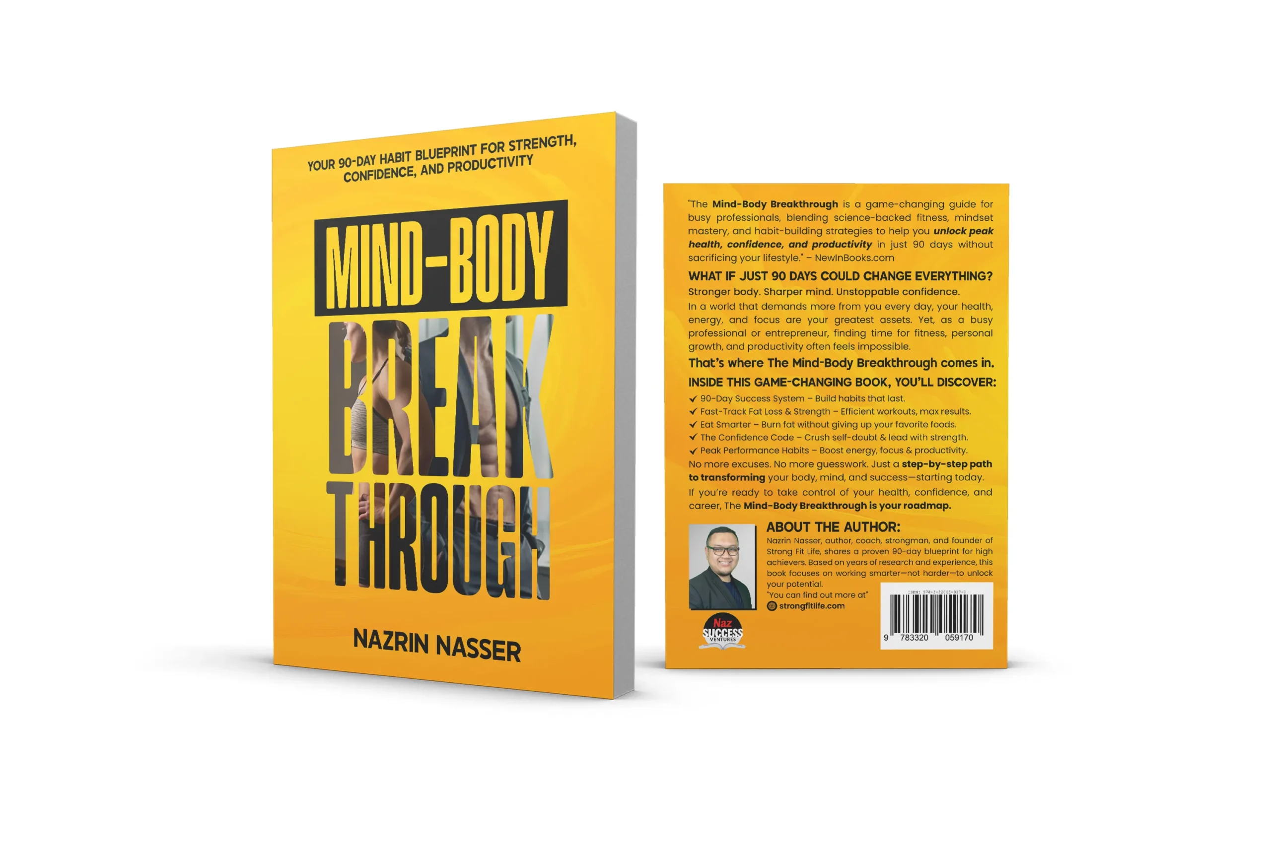
At Authoryn, we’ve reviewed thousands of book covers across genres, and we see the same mistakes repeated again and again. In this article, we’ll break down the 10 most common book cover design mistakes and show you how to avoid them so your book looks professional, market-ready, and irresistible.
1. Ignoring Genre Expectations
One of the biggest mistakes authors make is designing a cover that doesn’t match the genre.
A romance novel with a corporate-style cover or a fantasy novel with a minimalist business design will confuse readers — and confused readers don’t buy.
How to avoid it: Study the top 20 bestsellers in your genre and note:
Color schemes
Typography styles
Image types
Mood and tone
Your cover doesn’t need to copy them — but it must visually belong on the same shelf.
2. Poor Typography Choices
Fonts communicate emotion. Using generic, outdated, or hard-to-read fonts instantly lowers the perceived value of your book.
Common typography mistakes include:
Overusing script or novelty fonts
Mixing too many font styles
Thin fonts that disappear at thumbnail size
How to avoid it: Limit your cover to 1–2 professional fonts, ensure strong contrast, and test readability at small sizes.
professional book cover typography

3. Overcrowded Design
Trying to include everything — characters, symbols, backgrounds, taglines — leads to visual chaos.
A cluttered cover:
Overwhelms the reader
Lacks focus
Looks amateur
How to avoid it: Embrace white space. A strong focal point is more powerful than ten weak elements.
minimalist book cover design
4. Low-Quality or Stocky Images
Nothing kills credibility faster than pixelated images or overused stock photos.
Readers can spot:
Blurry images
Poor cutouts
Generic stock visuals
How to avoid it: Use high-resolution images and customize them with professional color grading, lighting, and composition — or commission custom artwork.

5. Weak Visual Hierarchy
If readers can’t immediately tell:
1. The book title
2. The genre
3. The tone
…your cover is failing its primary job.
How to avoid it: Create a clear hierarchy:
Title = most prominent
Subtitle = secondary
Author name = visible but balanced
Your eye should know exactly where to look first.
6. Not Optimizing for Thumbnails
Most books are discovered online — at thumbnail size.
A cover that looks great full-size but fails when small will underperform on:
Amazon
Social media ads
How to avoid it: Zoom out your design to thumbnail size. If the title isn’t readable, redesign.
Amazon book cover optimization
7. Inconsistent Branding in a Series
If you’re writing a series, inconsistent covers confuse readers and weaken brand recognition.
Different fonts, layouts, or styles make books look unrelated — even if they’re connected.
How to avoid it: Use:
Consistent typography
Repeating layout structure
Cohesive color palettes
Series branding builds trust and boosts binge purchases.
8. Poor Color Choices
Colors evoke emotion. Using the wrong palette can send the wrong message.
For example:
Bright colors for dark thrillers
Muted tones for children’s books
How to avoid it: Choose colors that reflect the mood and genre of your story and maintain strong contrast for readability.
9. DIY Design Without Market Research
Designing your own cover without understanding the market often leads to amateur results even if the design looks “nice.”
A good cover isn’t just attractive; it’s strategic.
How to avoid it: Base design decisions on:
Genre trends
Reader psychology
Sales data
10. Not Getting Professional Feedback
Authors are emotionally attached to their work — which makes it hard to judge covers objectively.
What you love may not be what sells.
How to avoid it: Get feedback from:
Designers
Marketers
Target readers
Or work with professionals who understand both design and publishing trends.
Professional book cover review
Final Thoughts
A great book cover doesn’t just look good — it sells your story.
Avoiding these common book cover design mistakes can dramatically increase:
Click-through rates
Reader trust
Book sales
If you want a cover that aligns with your genre, stands out in the market, and converts browsers into buyers, Authoryn is here to help.